Subscribe to:
Post Comments (Atom)
Followers
Blog Archive
-
▼
2012
(219)
-
▼
March
(24)
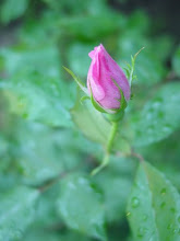
- Blooms...
- Beach shrubs...
- Swamp Walking...
- Up A Tree...
- Crocus...
- Prizes...
- Early Spring...
- Interesting Sky...
- Spring Fling...
- Sand Ripples...
- Blue Building...
- Different Light...
- Oops...
- Pine Cones...Free...
- Venus...
- Hooray!!!
- Fruits of their labor...
- and more...
- and her friend...
- Came Visiting...
- Squirrel Tracks...
- Good Bye Guys...
- More Snow...
- White Tree and ...
-
▼
March
(24)
About Me
Pussycat...
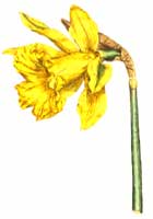
What Flower Are You??
|
I am a |
My Fairy Name...
Your fairy is called Tangle Saturnwand
She is a trouble maker.
She lives at the bottom of tangled gardens and in hedgerows.
She is only seen when the seer holds a four-leafed clover.
She wears tangled dresses of multicoloured petals. She has delicate pale pink wings like a cicada.


Yeah, the top one is much more vibrant!
ReplyDeleteWhat a difference. They are both beautiful. :o)
ReplyDeleteHey sweetie, I wanted to pop over and congratulate you on the great win over at Far Side's place. Oh, those little cottages are just precious.
Have a blessed day sweetie!!! :o)
Interesting what surprises you got!
ReplyDeleteThose are so cool!! Love them both
ReplyDeleteHugs
SUeAnn
I like how mysterious the top one looks.
ReplyDelete